01 — Overview
The institute’s results were exceptional. The site needed to prove them quickly and turn interest into admissions.
The problem
Working with business stakeholders, I found that students were convinced by the results but lost on the way to enrolment. Courses, discounts and payment lived on different paths, so a decision that should take minutes took a phone call.
The approach
Lead with proof, then make enrolment effortless. Results come first, every course page ends in a clear next step, and the cart explains every discount before the student pays.
02 — The screens
From proof to payment
Proof first
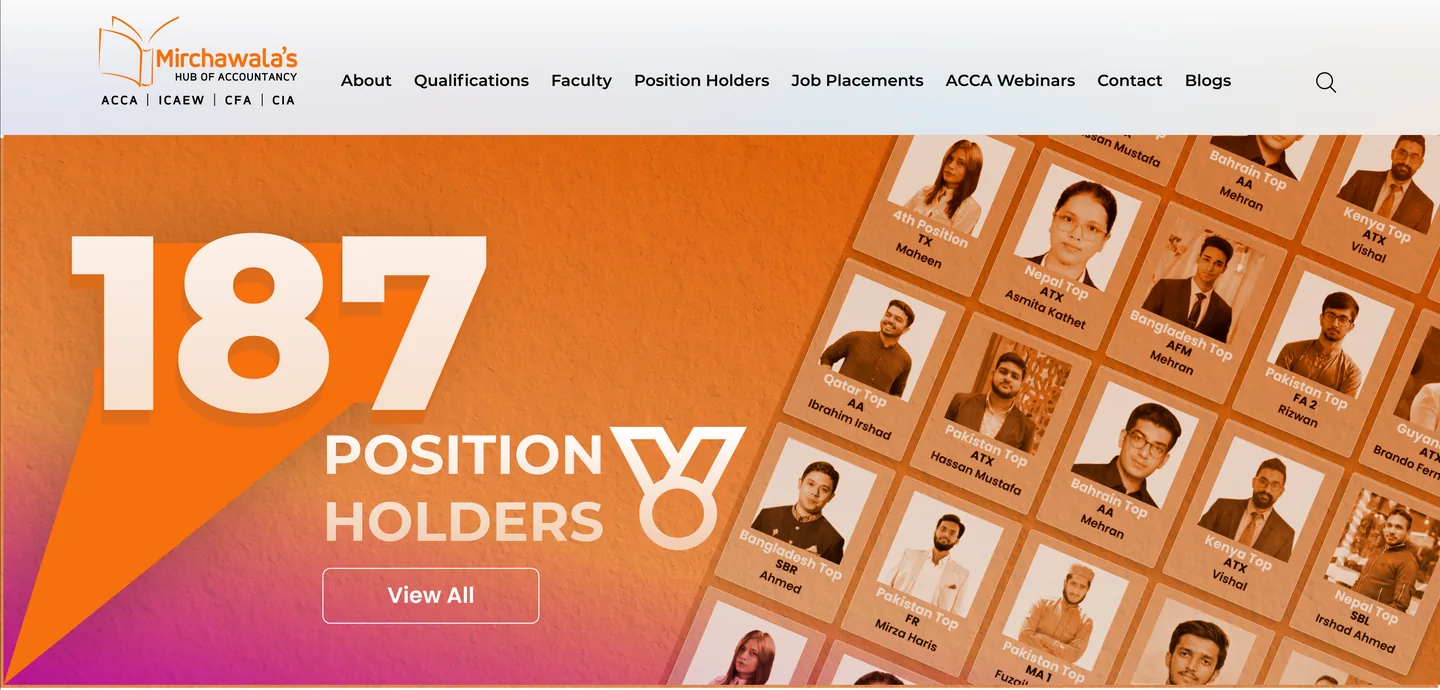
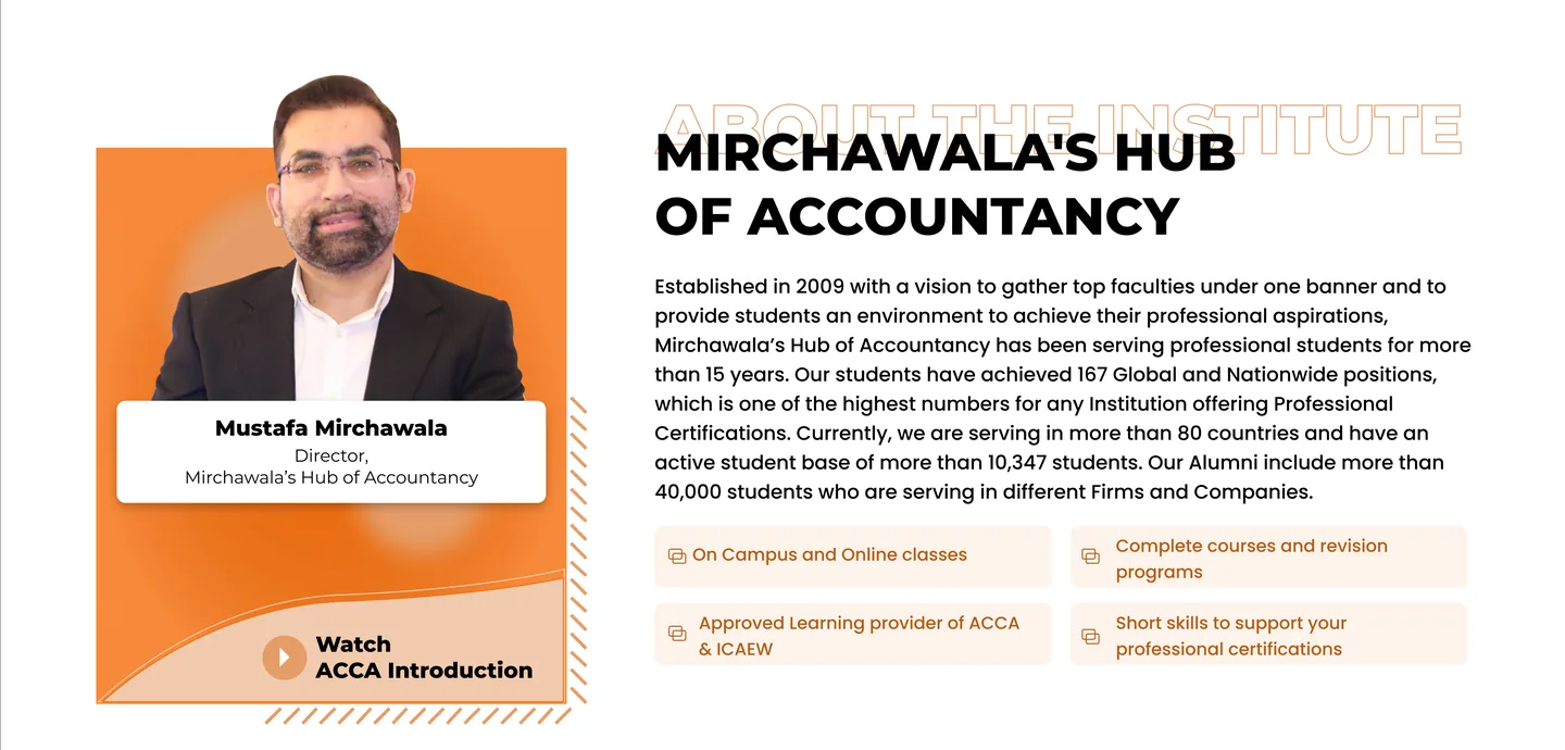
The homepage opens with the institute’s strongest asset: its position holders. Then it introduces the director, courses and numbers that build trust.
- Position holders as the hero, with a View All path
- Director’s introduction with a watch-video action
- Qualifications and courses in one scannable grid
Courses and credibility
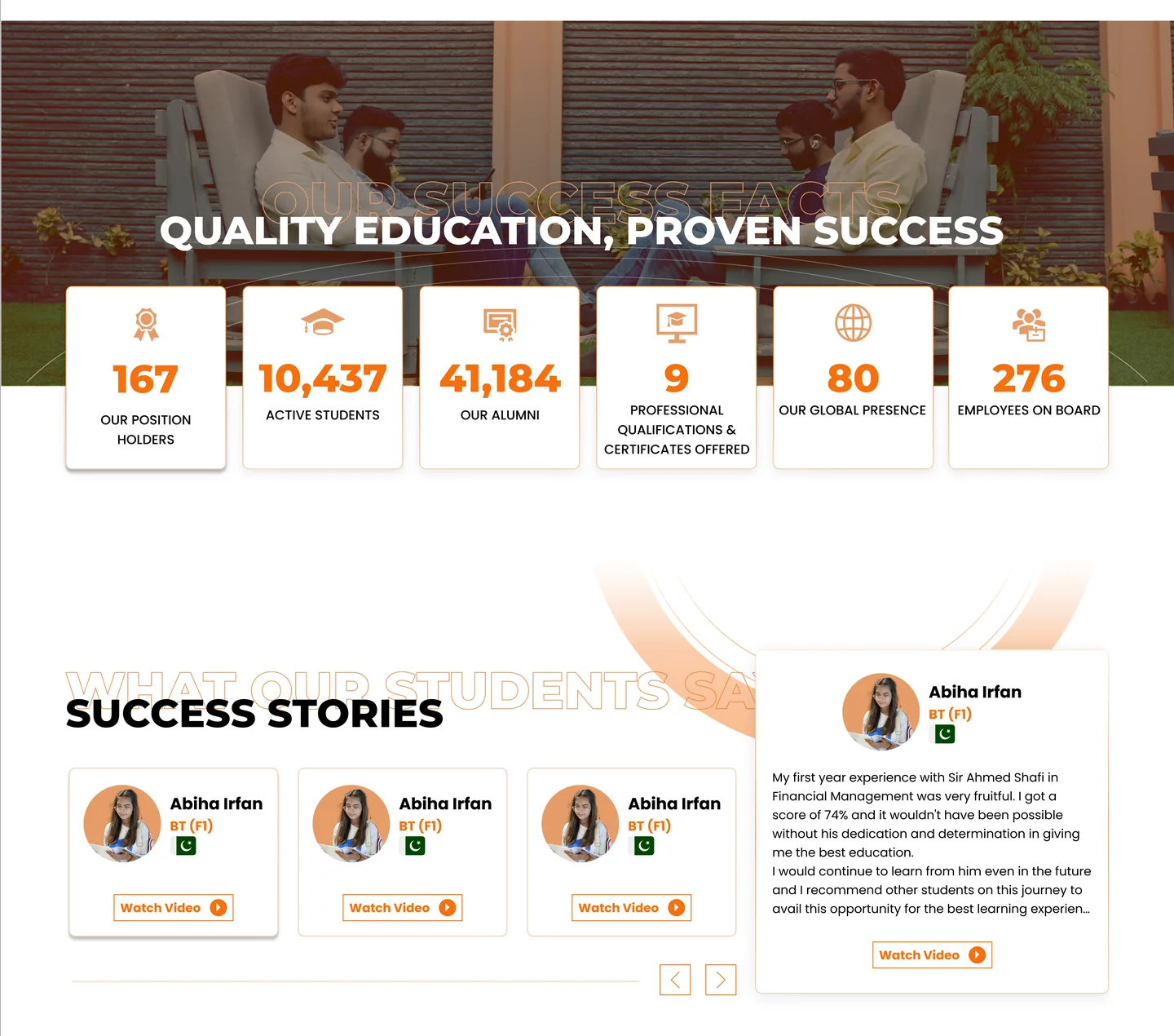
Qualification cards, headline numbers and student stories sit together, so a visitor can compare options and see the evidence without leaving the page.
- Course cards with a clear Explore action
- Stats band: position holders, students, alumni, global reach
- Student success stories with video
Learning that continues
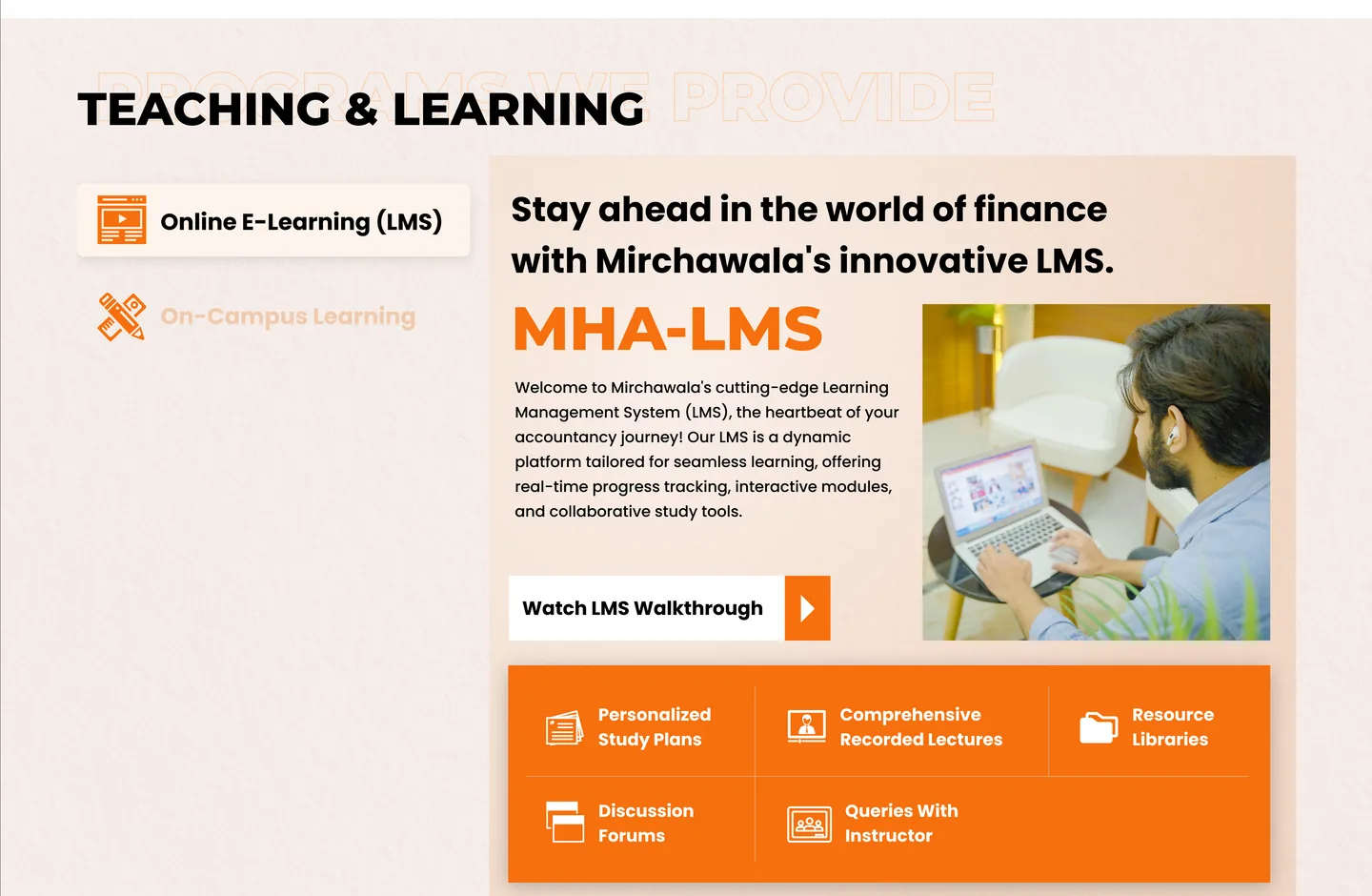
The MHA-LMS section shows students what happens after they enrol: study plans, recorded lectures, resources, forums and instructor support.
- One walkthrough video
- Four benefits, each with an icon
- Position holders wall for motivation
Enrolment as eCommerce
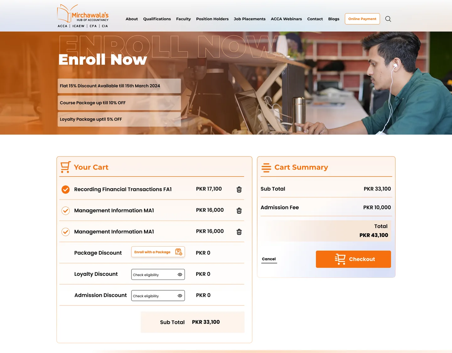
A cart built for a considered purchase. Students see each course, the admission fee, package, loyalty and admission discounts, and a running total before checkout. After launch I monitored usability and kept improving the cart.
- Cart and summary side by side
- Discount rules explained next to the total
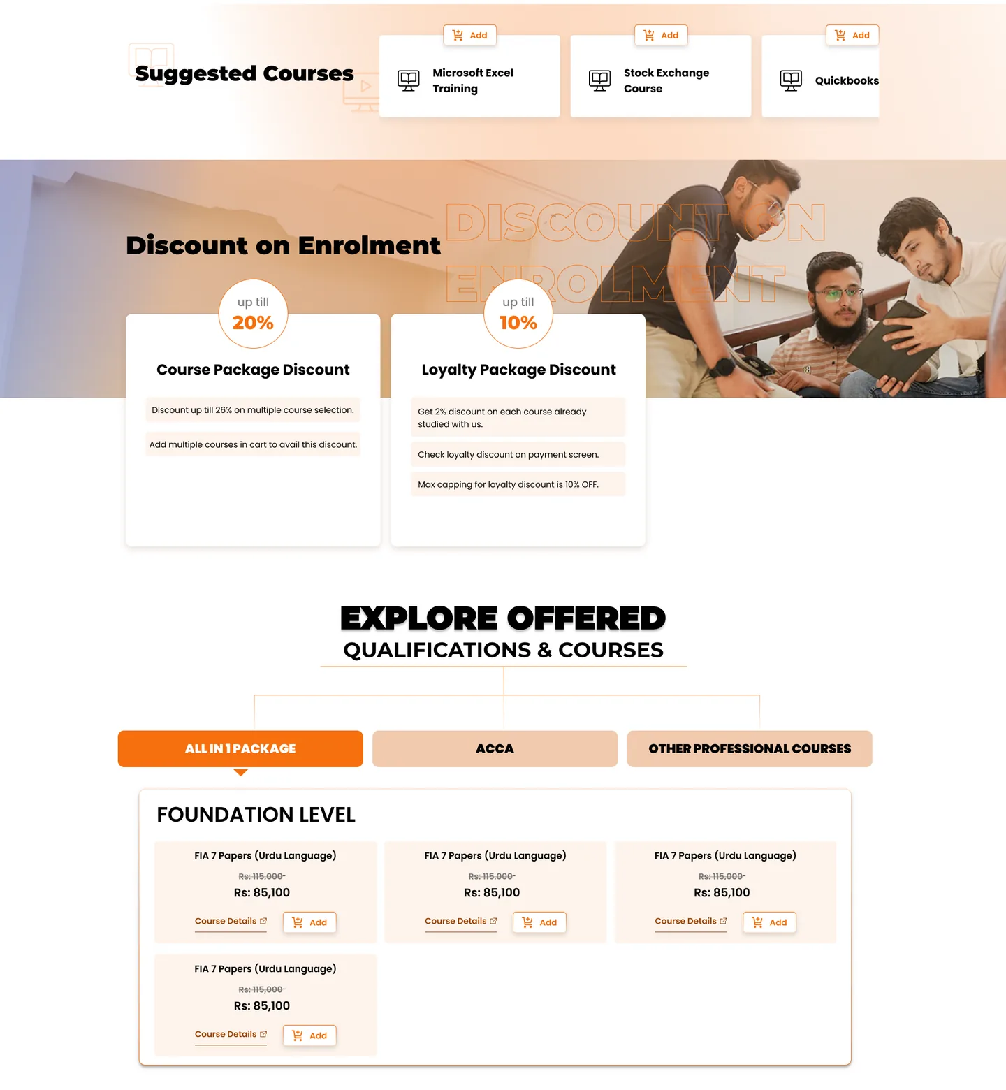
- Suggested courses added in one tap
Packages and offers
Discounts are shown as simple cards, and courses are grouped into All-in-1 Package, ACCA and Other Professional Courses, so the right bundle is easy to find.
- Tabbed course groups
- Original and discounted price shown together
- Course details and Add in each tile
03 — Mobile & campaigns
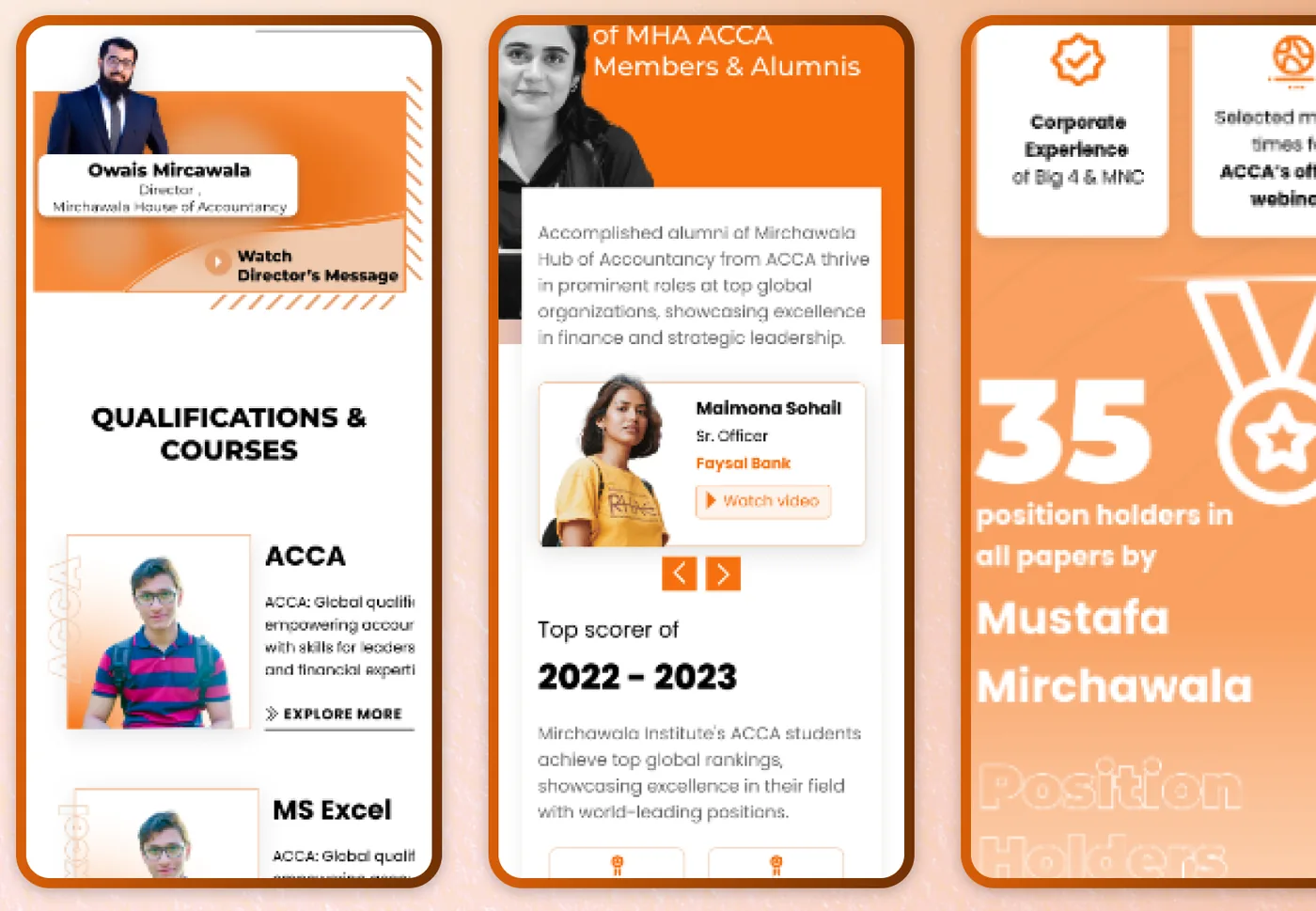
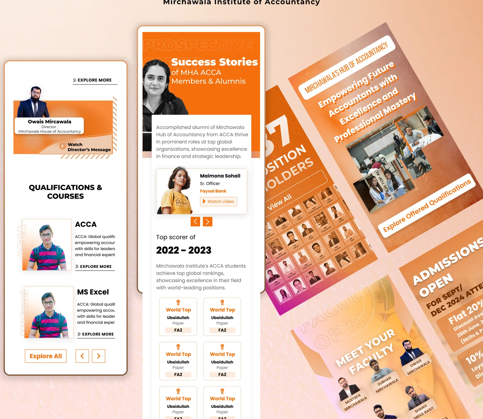
Designed for the phone in the student’s hand
One orange language
A bold orange palette, big numerals and outlined watermark headings give the brand energy, and the same system runs from the website to social and admission graphics.
My part
- Identified the problem with business stakeholders
- Designed the UX and UI in Figma
- Worked with the web developer so the WordPress build followed the design
- Monitored usability and improved the shopping cart